Book Design
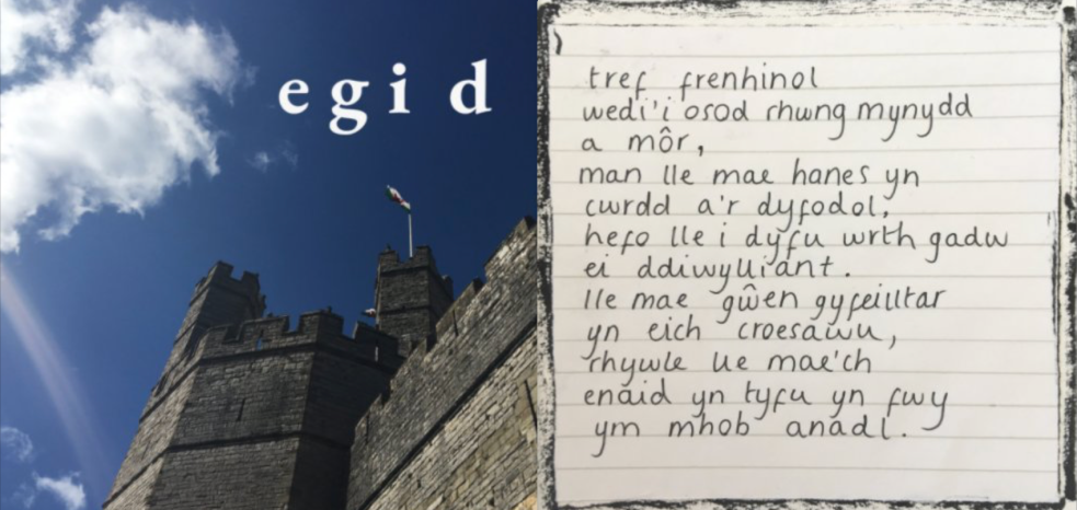
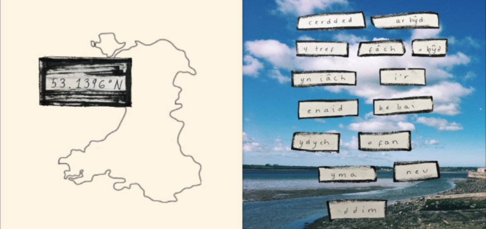
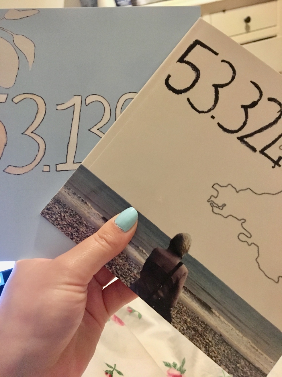
A bit part of this project has been my book designs which I created on Blurb BookWright. I have used this service before and have been very happy with the result. I enjoyed designing these books as they are almost an extension to my films. I wanted to have a physical piece of work for people to hold whilst watching the film.
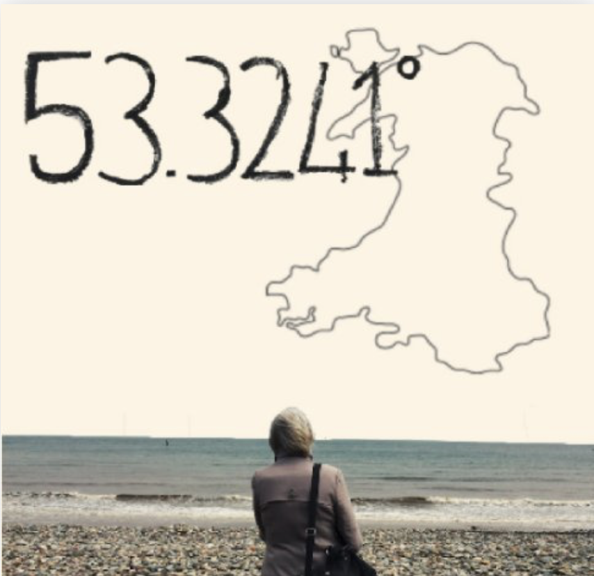
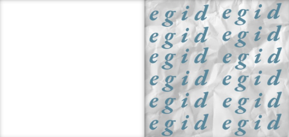
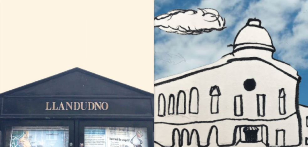
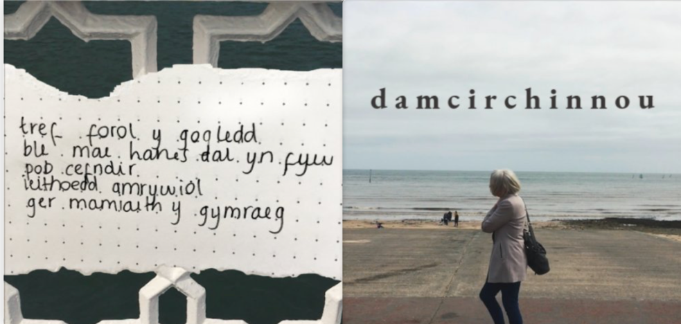
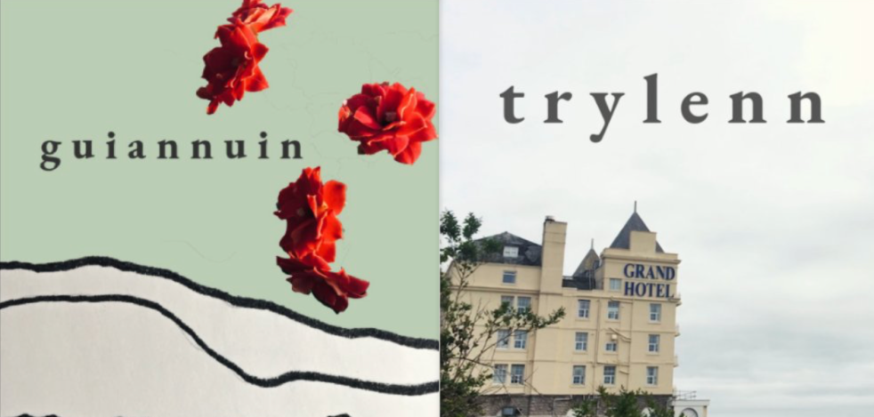
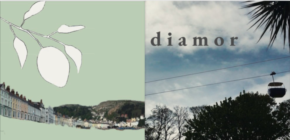
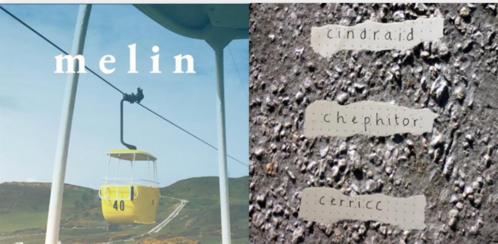
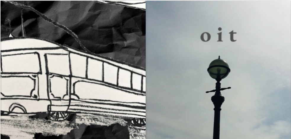
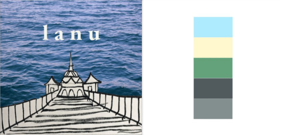
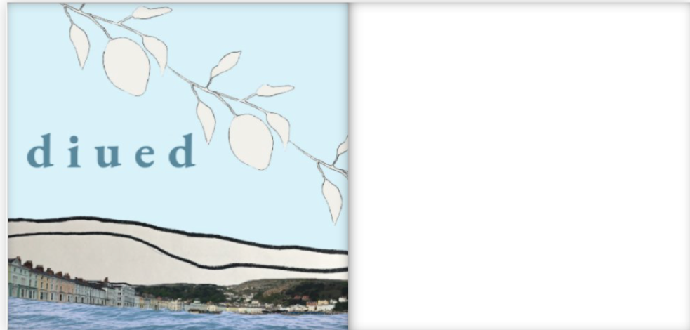
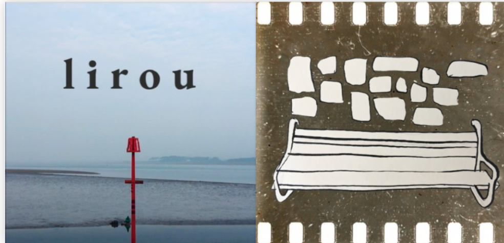
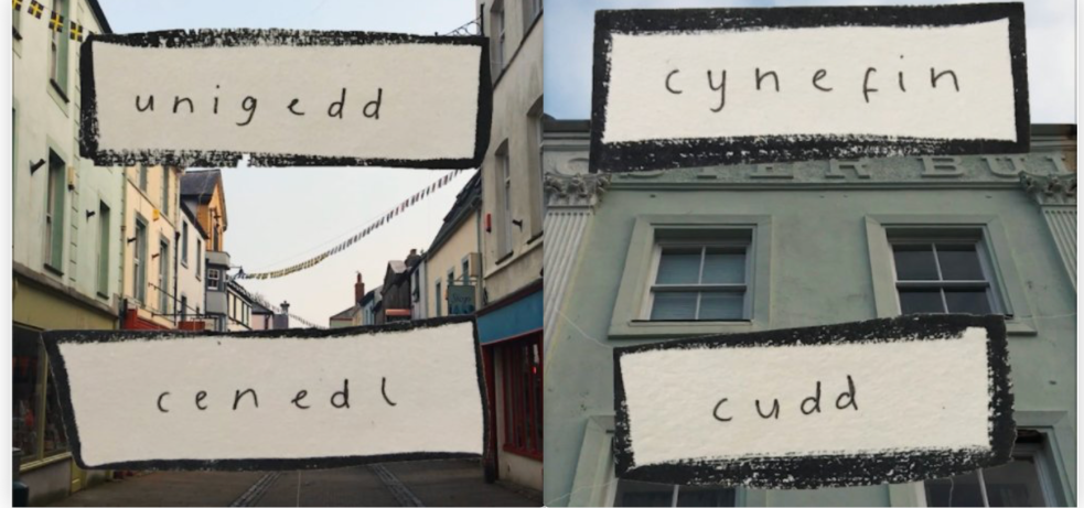
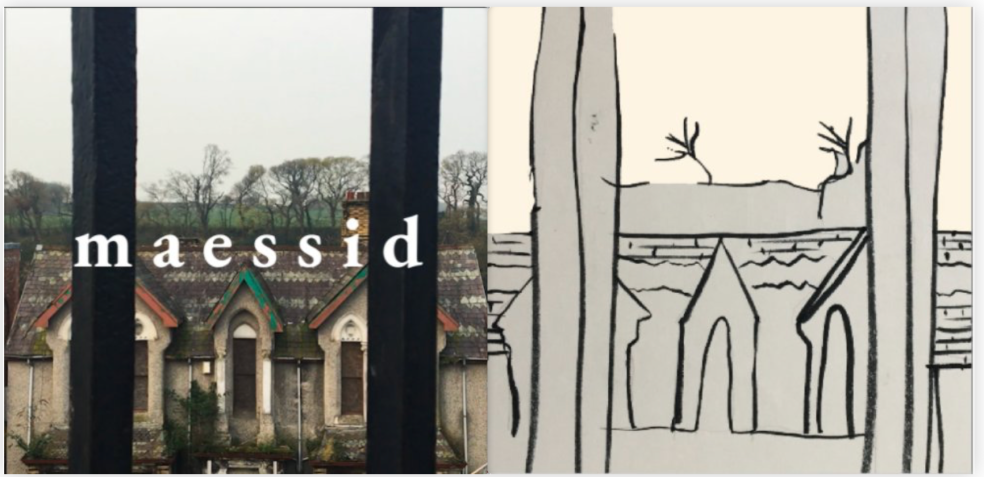
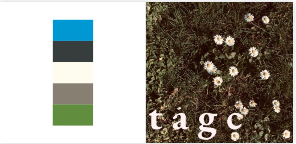
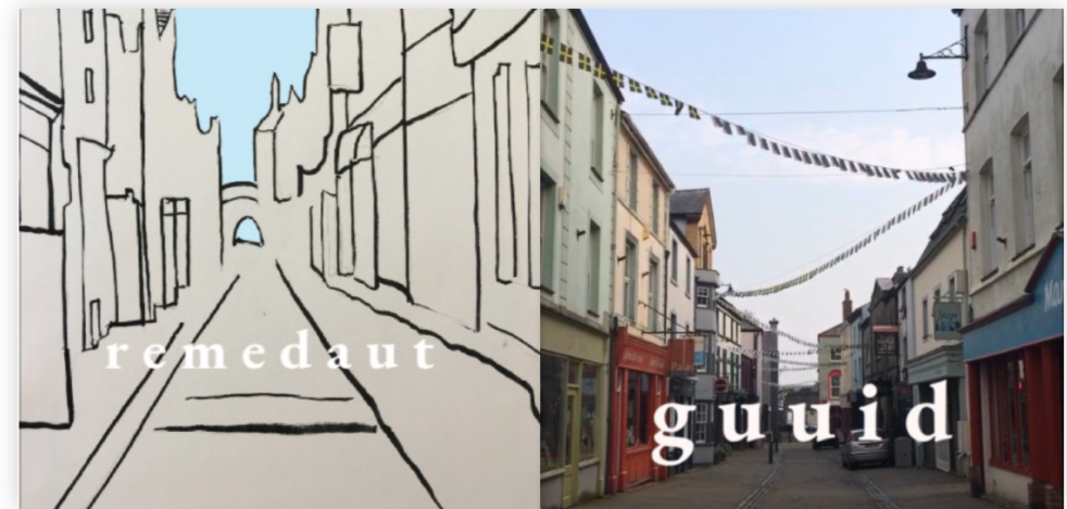
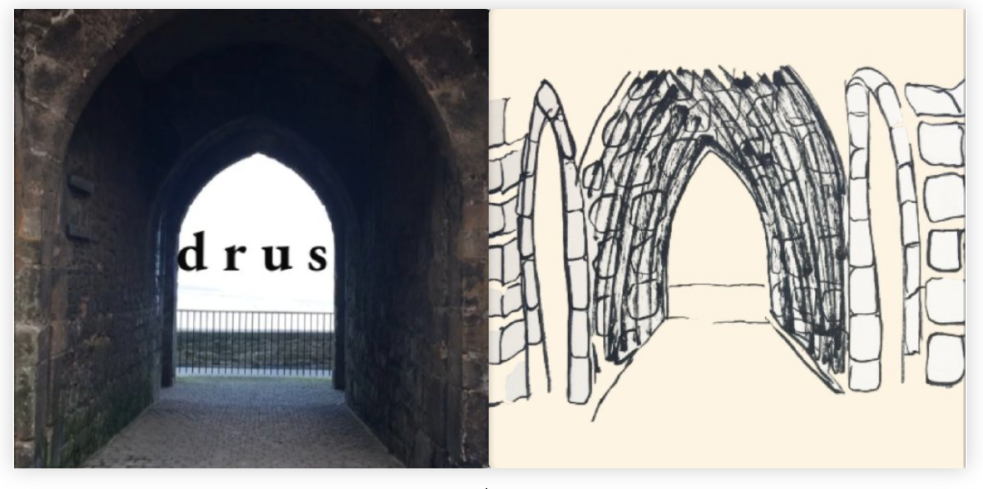
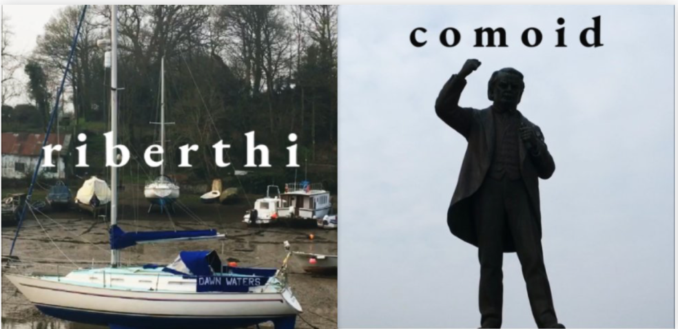
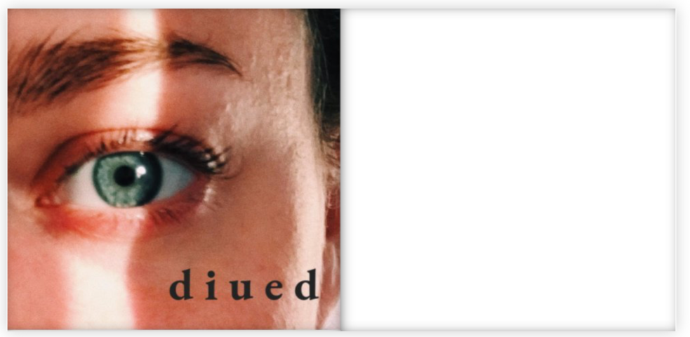
Research – Claude Garamond
I have used the Garamond typeface throughout this project as it fit with the context of my work perfectly. Here’s some research i gathered before and throughout this project, summarised.
- original inventor of the Garamond typeface
- originated in the 16th century
- caligraphist feel
- used in many roman and latin books
- the typeface revived by the end of the 19th century and beginning of the 20th century.
How I am using it in my project/work
- I accidentally came across this typeface a while back (happy accident)
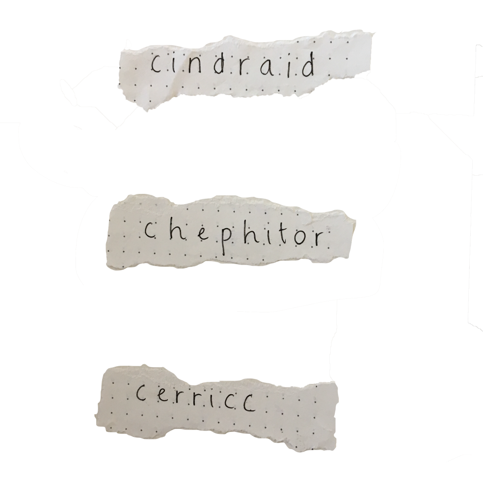
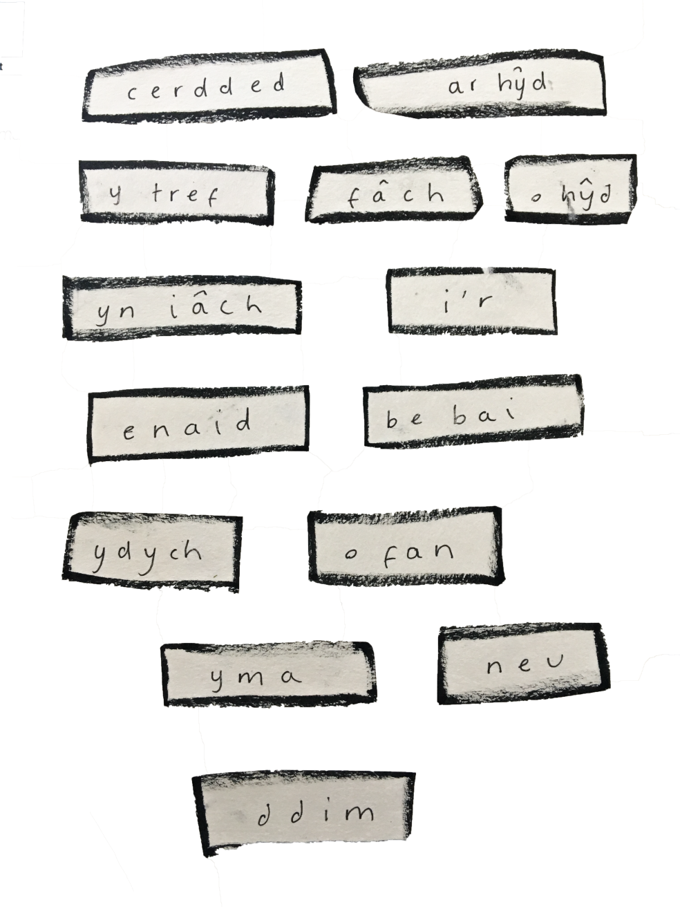
- I use all lowercase lettering throughout my project for the aesthetic (I’m not concerned about the grammar as it’s for visual purposes)
- I use a single space between each letter (again, for the aesthetic)
- for example – e l e r i
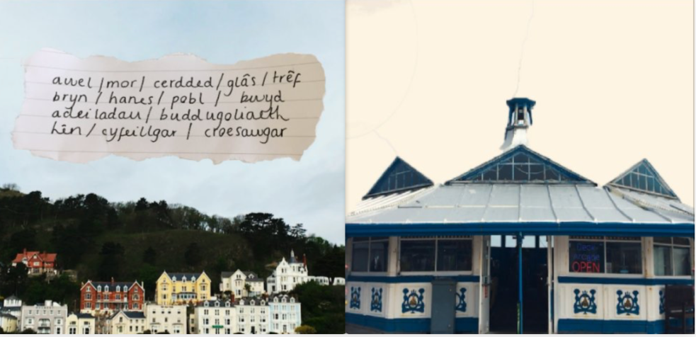
- the middle welsh words are almost unpronounceable/unreadable so to have something visually appealing is important.
My Proposal (looking back)
My Proposal
For the upcoming exhibition, my proposal is to display a projection of a series of moving image pieces, each with a duration of 90 seconds. Along with one or two books, (one with text and the other with stills) which could add context to the short films, could be displayed in front of the projection meaning the observers could read along whilst the shorts are playing if they wish to.
EDIT – Looking back, I did stick to my initial idea of having a display of films, both short in duration but wouldn’t have been great had they been longer. I feel as if both were experimental, especially with the photoshop pngs (my sketches) and has a unique aesthetic.
Regarding the main subject of these shorts, I seek to travel to architecturally/aesthetically isolated locations around where I live, and document them in short clips along with people that would recite a number of middle Welsh words that conveys what would be in the frame. The idea of having the footage of the modern-day whilst having the juxtaposition of the middle Welsh text, still acknowledges the language as I intend on the language being a prominent theme throughout each short, whilst also maintaining a contemporary aesthetic.
EDIT – The locations I ended up choosing were not architecturally or aesthetically isolated places. They’re old towns which are populated to a nice extent. Footage wise, I got exactly what I was looking for and happy that I didn’t go the isolated route.
Regarding the reciting of the Welsh words, I really liked this idea but failed to film this due to illness and poor time management. Had I also found more people to recite words, I would’ve definitely continued with this idea; Maybe in the future.
I definitely stuck to the juxtaposition of the modern clips with the old Welsh text, as it is such a prominent part of my work. Not having the text within my films would’ve definitely taken away from the initial idea.
Audio wise, the final product would have little to no music, so that I could record audio of the sounds of these locations (traffic, breeze, construction, echoes) having the audio speak for itself and to portray a more realistic, stark yet comforting atmosphere. The tone needs to be simple yet affective to both Welsh and Non-Welsh speakers. Having people reciting the Welsh words would also fill some emptiness.
EDIT – I didn’t stick to this idea as I didn’t end up going to isolated locations, and I have always put music in my films. I found that I do have a style, and that includes clear audio. I like the initial idea, and would’ve included them had they been appropriate for the final clips.
The space would be at a corner of the studio as a square shaped dark room with possible lowlight inside. Smaller lights could illuminate the books and any written information, but I am happy to also have a sheet of written text contextualising the films and such outside of the dark room in the normal studio lighting. Instead of four black walls, I might install some large pieces of black fabric instead so that they could draw as curtains, and also so that it’s not as invasive and bold. Inside this dark space, I might bring in a small number of chairs, thee or four so that there’s space to sit, but could also be a part of the display. As I am looking for a specific colour palette within the films, I could go on to make the chairs complimentary colours. I would possibly need spotlights to illuminate these chairs as I don’t want them to be an obstruction to the observers.
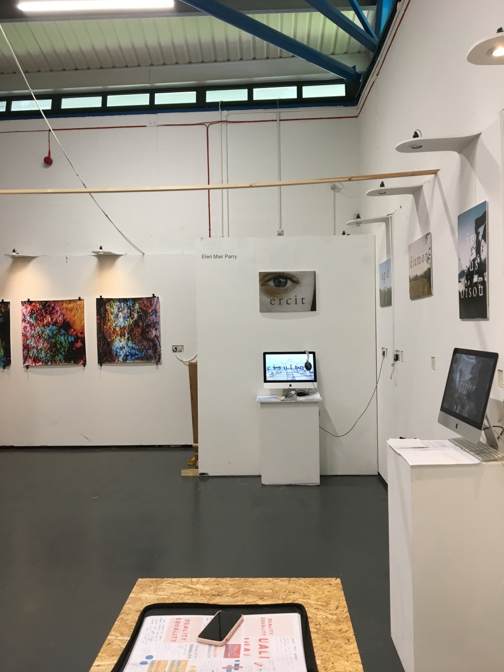
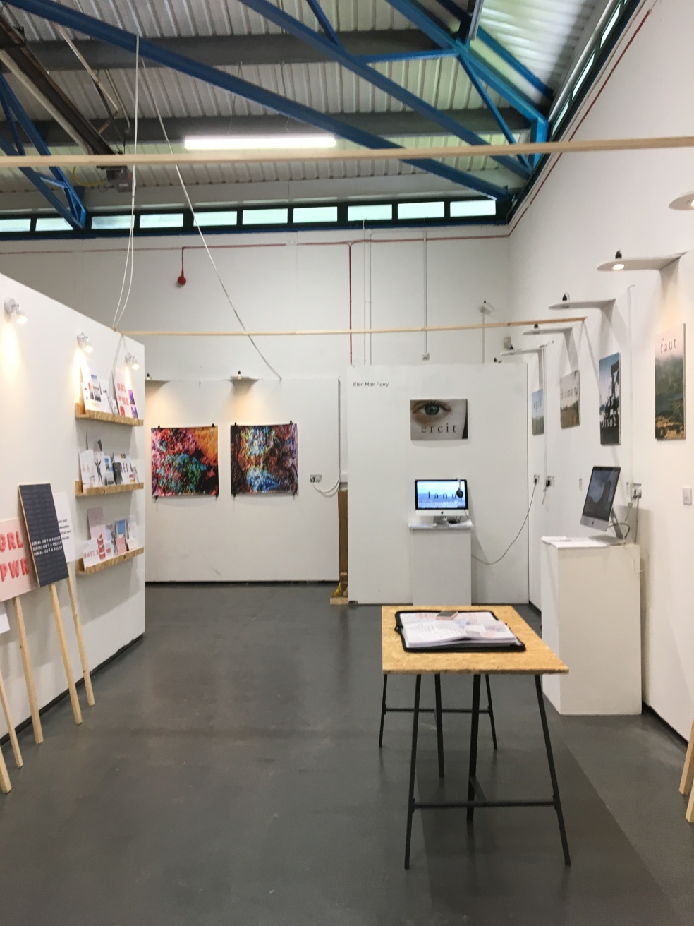
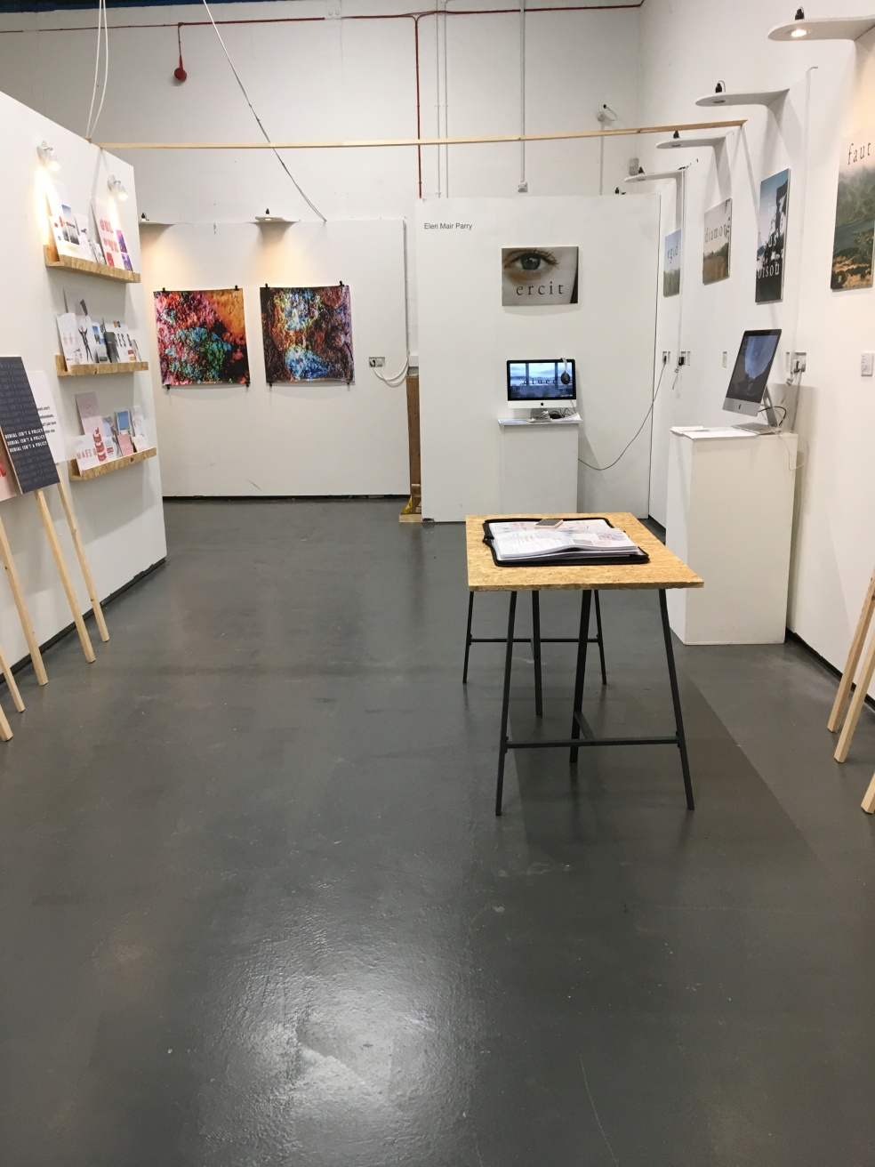
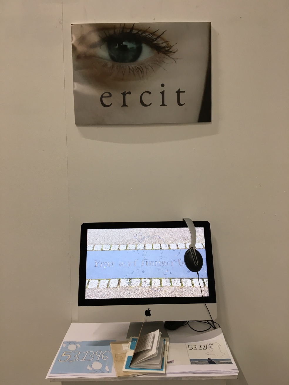
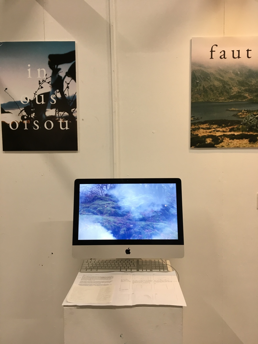
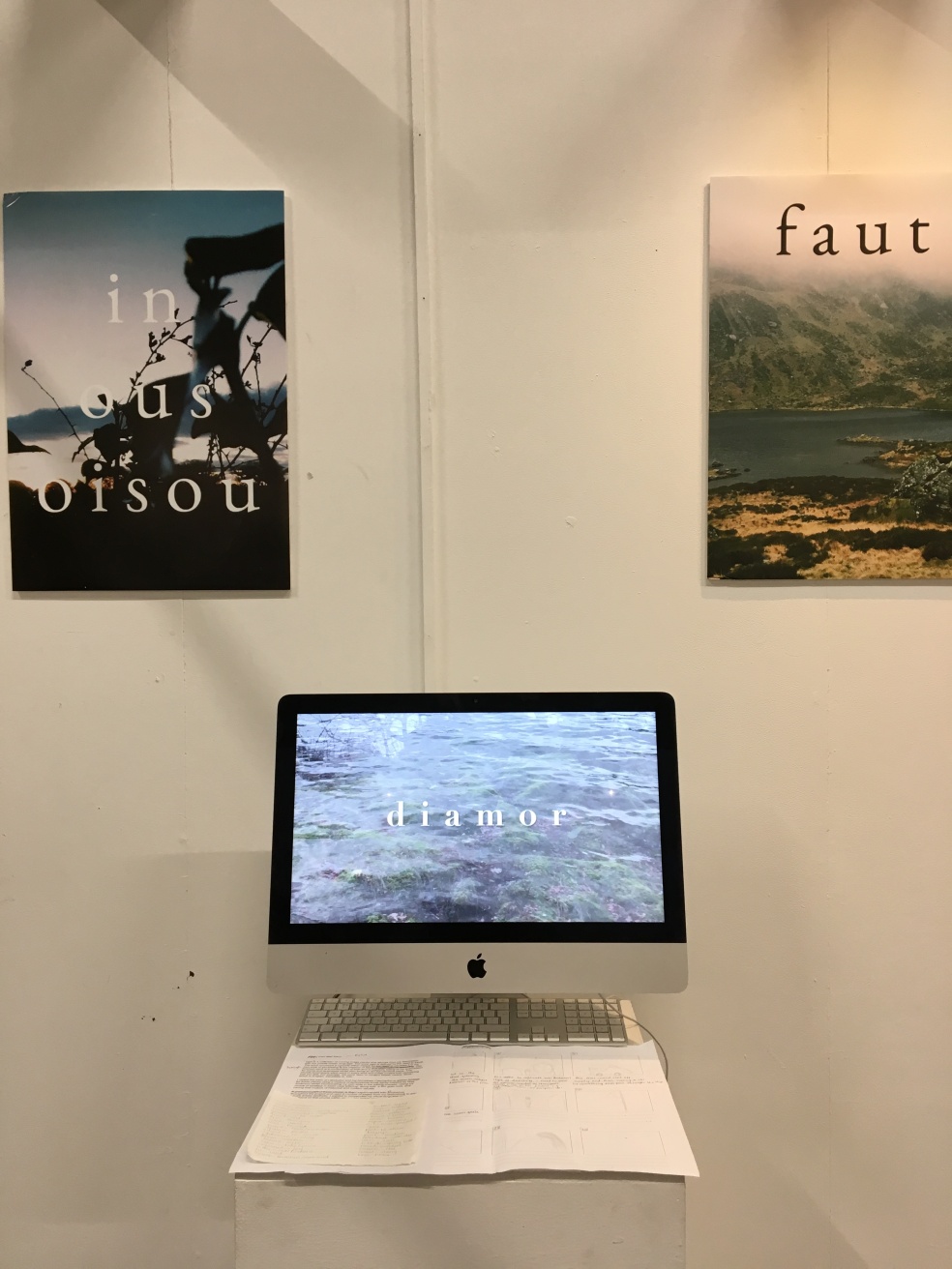
EDIT – My space is vastly different to what I intended. I see this as a positive change because it was an adventurous way of displaying the films, but wouldn’t have suited the final result (in my opinion) and again, battling with illness very much affected this plan. I have now placed two macs on two plinths, both displaying these films. I have also placed a pair of headphones on each mac so that the viewer could listen and watch the footage clearly. I also didn’t want to explain the film too much as I wanted it to speak for itself, so I’ve done a vague enough description of my work.
Wes Anderson and his influence in my project.
Wes Anderson is my favourite filmmaker. He’s mostly known for his signature colour palettes and symmetry. Mainly inspired by European cinema and older stories, he has a way of modernising them whilst also keeping to an older aesthetic. From the buildings to the colours. I’ve noticed most of his films links to the theme of travel, and also having a distinctive character. Along with string arrangements as a soundtrack and back and forth dialogue, results in a unique piece of moving image.
His influence on my project is light yet also present. I also have the idea of combining history and the present together, experimenting with text and colour. I also have experimented with symmetry myself. I don’t want to replicate his work to an excessive extent so I have also combined my own style of filming and editing which will hopefully be clear in the end result.
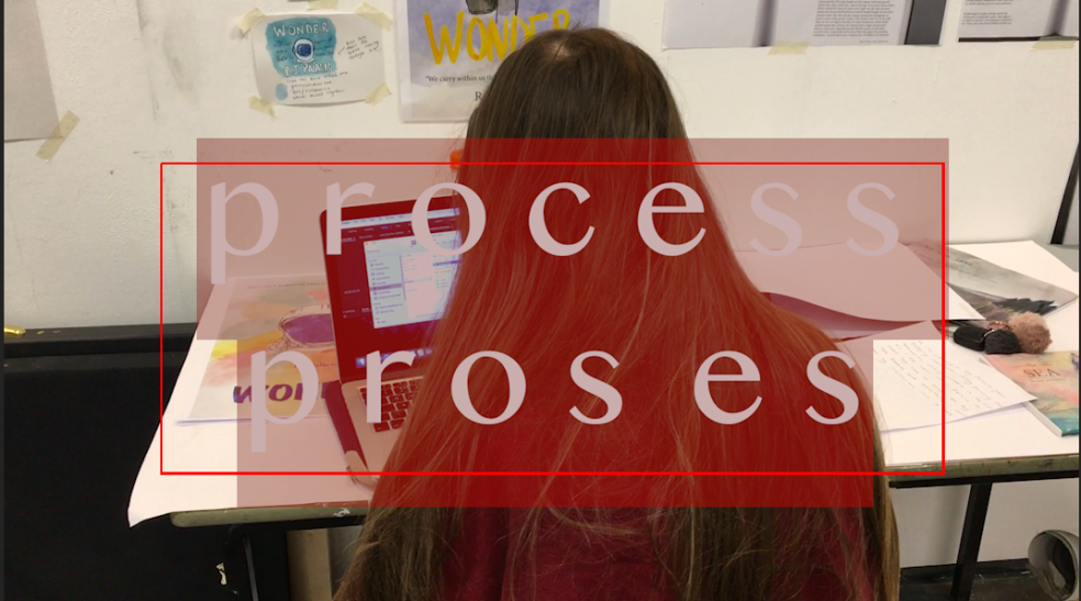
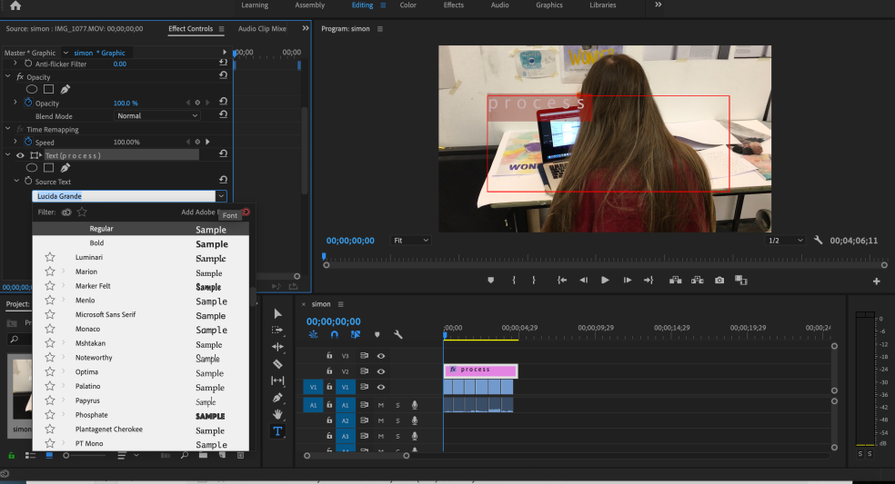
Exhibition Assignment – premiere pro screenshots of process
I have previously used premier pro as a software and I have grown very fond of it. I found it challenging to begin with but when I started to experiment with layering and audio, I found it an enjoyable experience. Editing footage with text and some pages from my sketchbook took double the amount of time but it’s worth it. Had it not had that artistic/narrative layer to it, the film(s) would’ve been quite plain. Pleasant but plain.
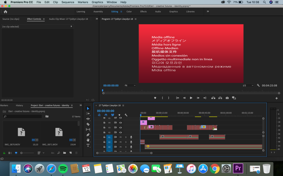
Here’s my process in screenshots.
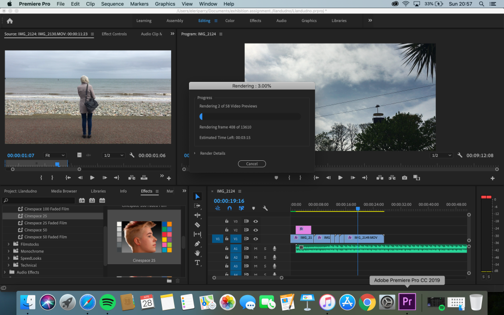
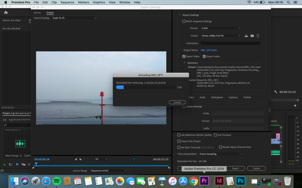
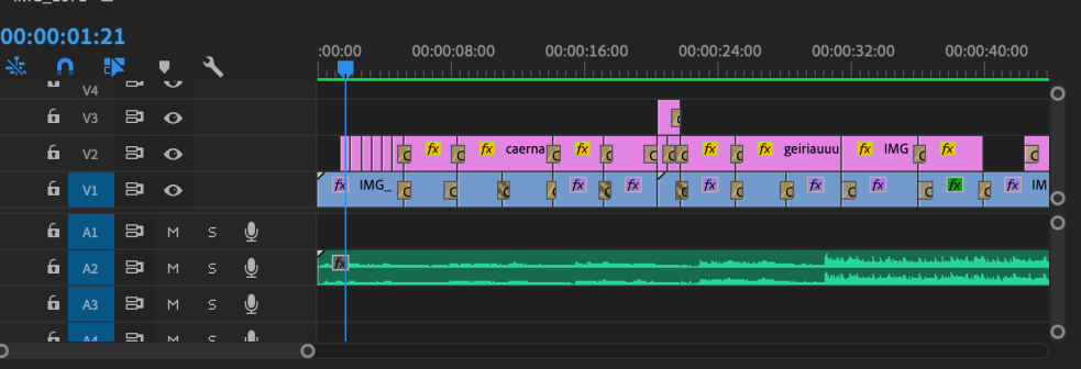
With lots of cutting down footage/changing music/adding cross dissolves and many a rendering, I have finished both films. Together, they’re approximately 3 minutes long which I think is long enough as it would’ve been a bit too busy had it been longer. I want people to be engaged throughout and have their full attention, and having a longer film could easily distract them.
Exhibition Assignment
As I continue with the assignment, I plan to gather some footage of various towns, depending on time and possibility. My plan is to visit an older town and my hometown as it’s a part of my work.
And that’s what I’ve done! All around I would say that I have too much footage for a short video but it’s better for me to have too much so I can be experimental with my editing/post production.
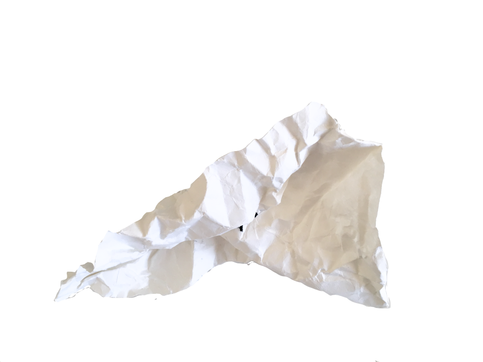
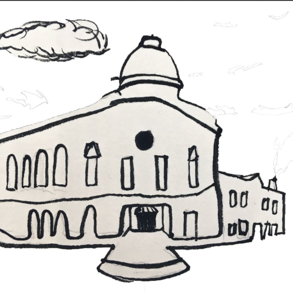
I have also began to experiment with photoshop in regards to my sketchbooks, which are mostly small books with observational drawings. I have also exported them as png files so that they’re easily edited with the transparent background. I also figured that I could intertwine my drawings/sketchbook pages within my film(s) in some way.
Creative Futures – Progress, Process & Problems
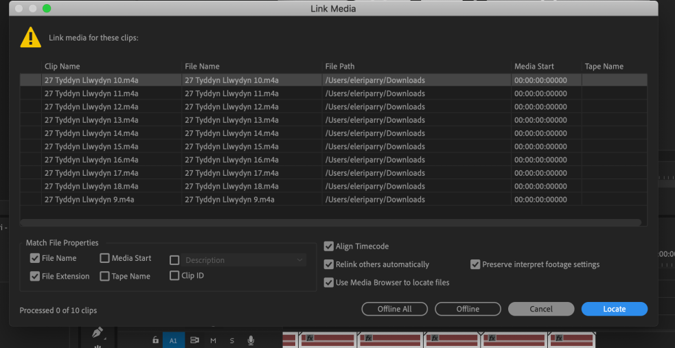
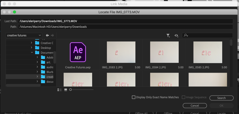
I’ve come across some problems throughout the editing process that I wanted to log as the end product will show that I have conquered them.
Problem (minor) – Poor positioning text boxes.
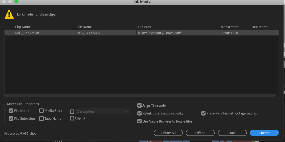
Problem (major) – I lost all of my files as I had a file clear-out the day before (not a good idea) But have salvaged that as I luckily had copies of everything in another folder.
